Shades Of A 007
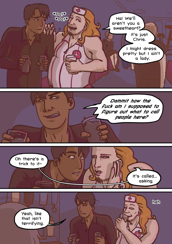
One thing I’m trying to get out of the habit of is drawing my characters too pretty- the problem with pretty is that it’s synonymous with boring and expressionless.
Also interesting noses. I have a borderline nose fetish, things like this study bring me utmost excitement:
Next livestream Thursday at 9am as usual!


Neat study, but they only surveyed Caucasian noses (Israeli and a few European countries, looks like). There are some pretty interesting noses common to African, Asian, Indian, etc folks, like the broader, flatter nose. I guess some of those are similar, but it’d be neat to see a “noses of the world” kind of thing, hah. Anyway, I can’t even figure out which type of nose I have..
For not wanting pretty characters, you sure gave Chris some pretty hair there. He should be on a shampoo commercial. :D
Right before I drew this page I saw a guy in the pub with red hair that was just as beautiful. I’d already designed Chris, but he inspired me to make it a bit more luxurious.
Long red hair is soooo pretty. It’s almost hypnotizing.
I’m slightly in love with Noel Fielding’s nose, speaking of interesting noses ><
As am I…are you a Fieldmouse too?
Yes!! An American Fieldmouse, no less. Which means I don’t meet others too often T_T
I actually have a problem with noses where they all wind up looking very similar to mine. At least I know to pay attention to it now to try and avoid it.
I think you’re doing wonderfully trying to give your characters more … character. Keep it up :>
Hey Tab ! I really enjoy the first pages of this new comic (I will miss Khaos forever T_T), but I find this font very confusing and hard to read. Maybe it’s just me… Anyway, as usual your art is amazing!
What are other people’s thoughts on this? If I have to change I want to do it early on!
I’ve grown used to it, but I’ll admit it’s not the easiest on the eyes.
Yeah, seconding Helena.
Yeah, it’s not impossible to read, but I have to definitely slow down. Although that’s not necessarily bad.
It’s legible, but I keep thinking that it’s a thought bubble rather than a speech bubble, such as in the second panel of this page. That may be due to the different shape of the bubble though, in addition to the italic appearance of the font.
I can read it, but I do think you’d be better served by a simpler font.
I can read the font just fine, but I don’t think it matches the art at all. And with the slant of the letters it does look like everything’s in a thought bubble.
I think the font’s biggest problem is really shitty kerning. The e looks like it has an apostrophe next to it, so with that and the weird spacing, “well” looks like “we’ ll”. Because I have OCD tendencies, I’d personally lean towards keeping the same font for the rest of this story unless you’re going to go back and replace it all (totally not expecting you to do that) and then use another font for the next story.
It’s official I’m in love with Chris, and his nose :)
LOL. This page made me chuckle. I think I’m going to like Chris. xD And btw, your color scheme for this is really great!
On a side note… WHOA it’s so weird you posted that.. I was just reading about the 14 nose types a few weeks ago.
Cheers- the colour scheme is actually only 3 colours, just with different levels of black and white in them. It makes it easier to get things to match!
what are you doing the speach bubbles with? may i suggest drawing a white shape and adding a stroke effect to it using layer effects if you are using photoshop, this should get rid of that slight white halo,
keep up the good work :) loved khaos and now loving this too!
This is manga studio so I’m not sure what’s causing the halo- it doesn’t turn up before the image is exported. Any experience with that?
yeah sorry no idea :/
I used to use Manga Studio… did you flatten the image before exporting it? That might be what’s causing the halo. It’s been years since I’ve used the program, but it’s something to try at least. xD
On the other hand, I find Chris to be quite pretty.
Haha I love them both already. The comment box colour is way easier. And I agree, non-standard-beauty is the best.
I agree. I get really tired of the standard beauty thing. Sappy, but I actually really like that people look different and uniquely beautiful. I’m glad Tab is going this route.
Tab, I love how while your art is so much more varied here than in Khaos, it’s still easy to identify your style :D
Lmaoooo. Kid, clam yo tits. They’re not gonna bite you.
Clam yo tits, like the little mermaid
I LOVE CHRIS ALREADY!! :’DD
No thursday comic? :( Yeah Chris rocks, I agree!
Hello? Is this mike on? Where’s 008? I hope everything’s okay.
Meanwhile, I was trying to remember the name of a webcomic that was like Khaos. I think it used to advertise there. It included an Arabian lesbian and a bisexual Asian who made clothes and used to dye his hair blonde. If that clues anyone in I’d like to know so I could see it again.
I think you’re thinking of “Bridges” http://bridgescomic.com/
That was it exactly. Thanks!
Chris, I think this is the beginning to a very beautiful “favorite character”-ship :D
Chris is awesome.